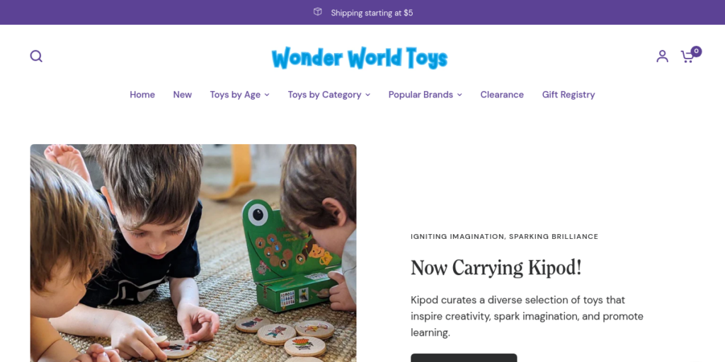
Creating a captivating Toy store website design is essential to attracting families and sparking children’s excitement. When designing a website for a toy store, it’s important to keep things colorful, fun, and easy to navigate. Using vibrant colors, playful fonts, and animated elements can help create a joyful atmosphere that matches the energy of a toy store. The layout should be clear, with organized sections that let visitors find popular categories like educational toys, games, and outdoor play items quickly. Eye-catching images and well-placed calls to action also encourage visitors to explore more.
A successful website design for a toy store should also focus on being user-friendly. Since many visitors will be parents, grandparents, and caregivers, having a smooth, easy-to-use interface is essential. Consider including filters for age, price, or type of toy, so customers can easily find what they need. Displaying high-quality images of the toys from different angles can help visitors feel more confident in their purchases. Additionally, adding features like customer reviews and special offers makes the website feel engaging and trustworthy.
30 Best Toy Store Website Design
If you’re looking for inspiration or ideas, this article highlights 30 toy store website designs that showcase different approaches to layout, color, and functionality. Each example includes an image and a live URL so you can explore the designs yourself. Whether you’re a toy store website designer or a store owner wanting to redesign your website, these designs will give you fresh ideas on creating a delightful online shopping experience.
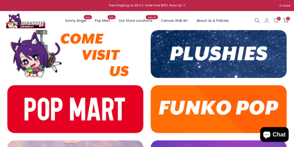
1. Top Canvas
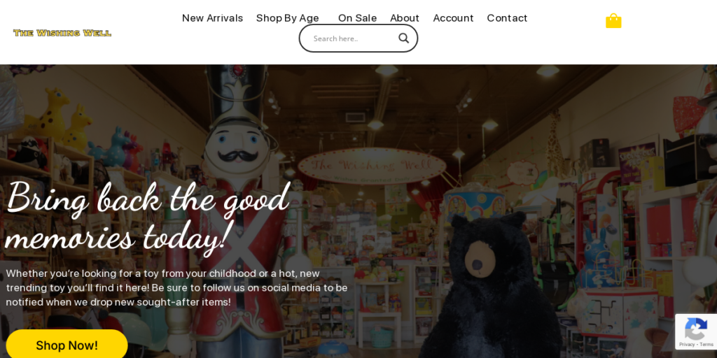
2. The Wishing Well Shop
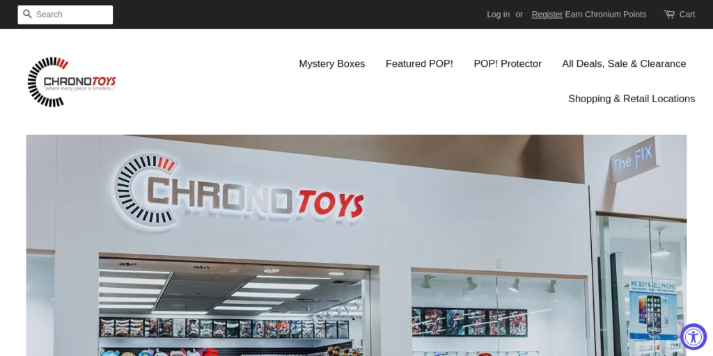
3. Chrono Toys
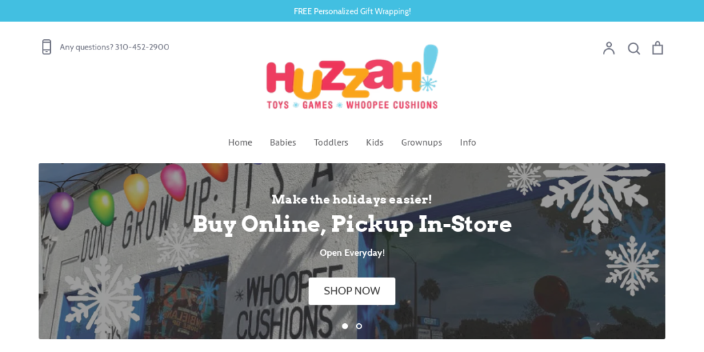
4. Huzzah Toys
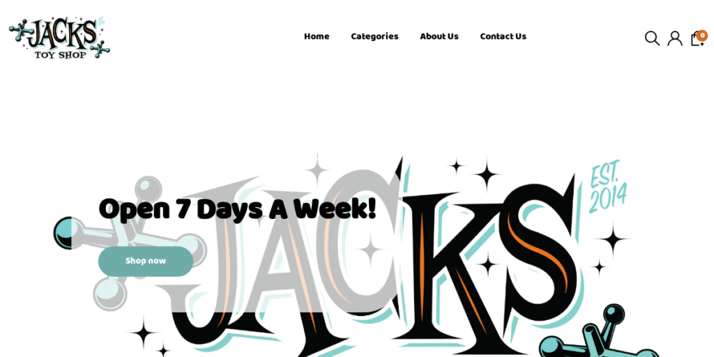
5. Jacks Toy Shop
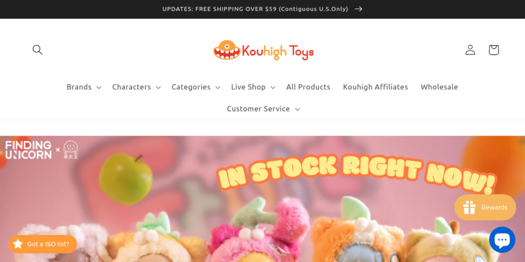
6. Kouhigh Toys
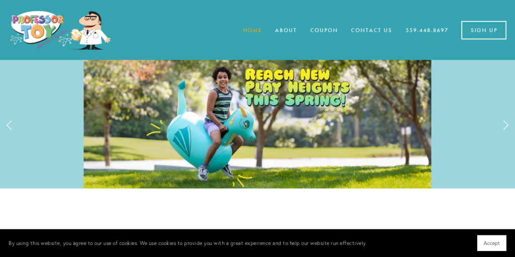
7. Professor Toy
8. Mini Motorz
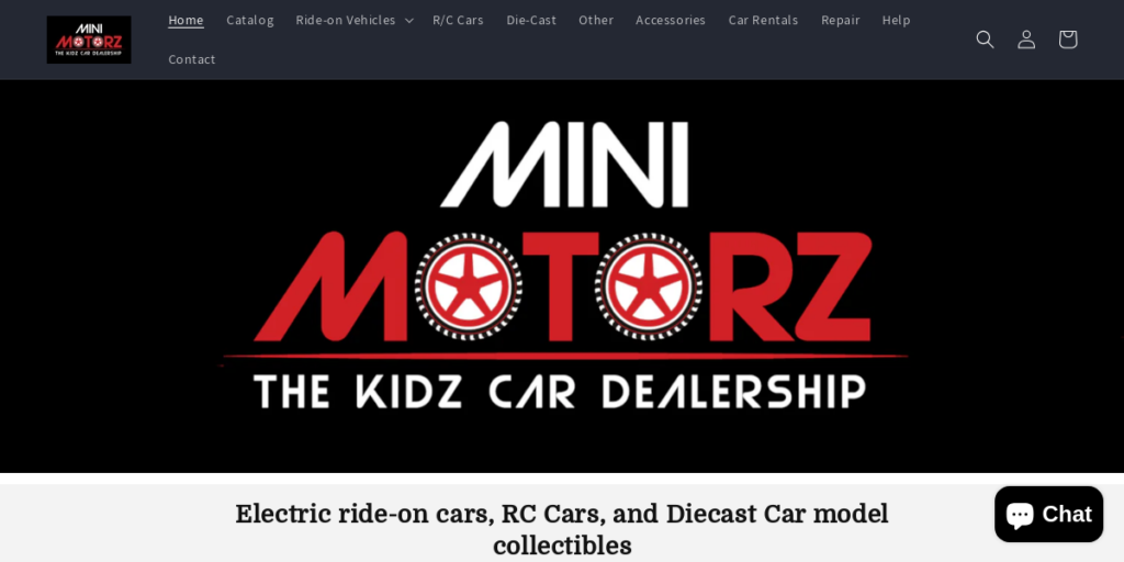
9. Go Toy Crazy
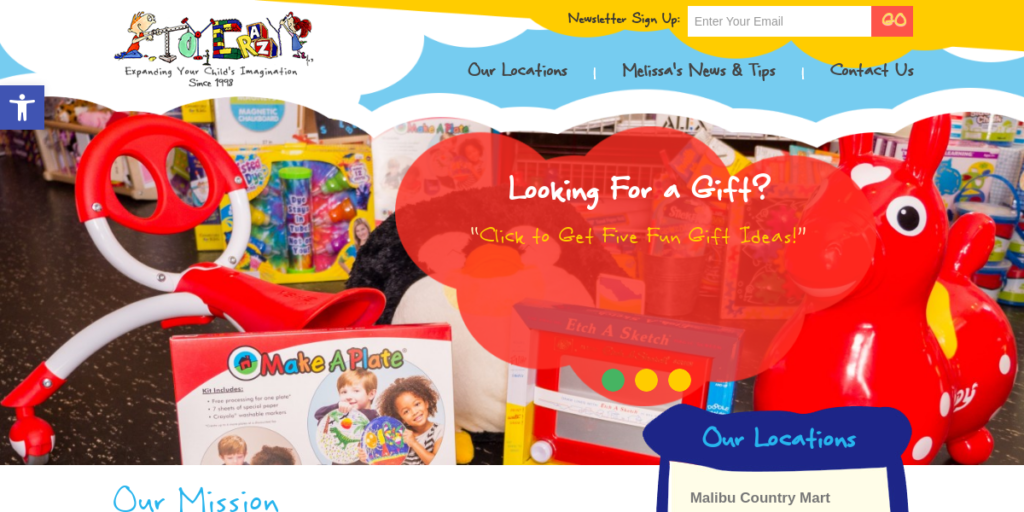
10. Magictoy Box
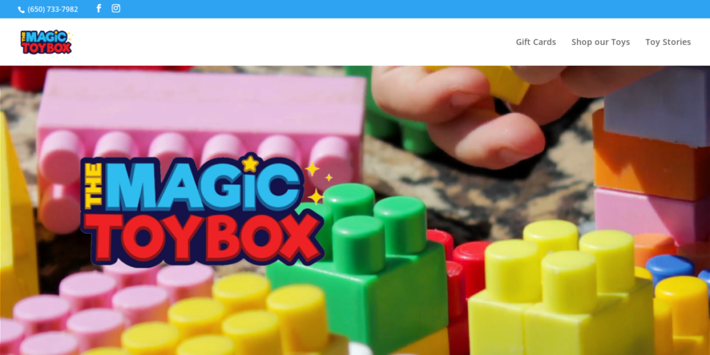
11. Stock California
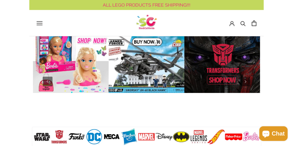
12. Woot Bear
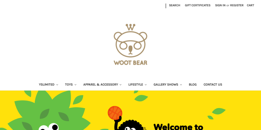
13. Fantasy Island Toys
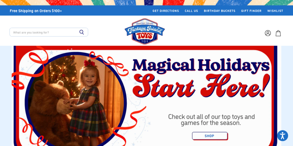
14. Rocket City Toys
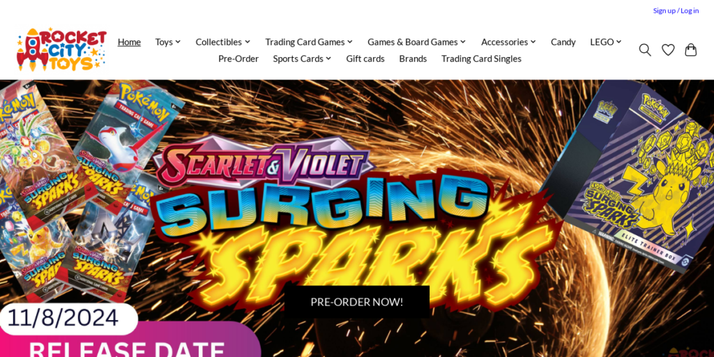
15. Learning Express
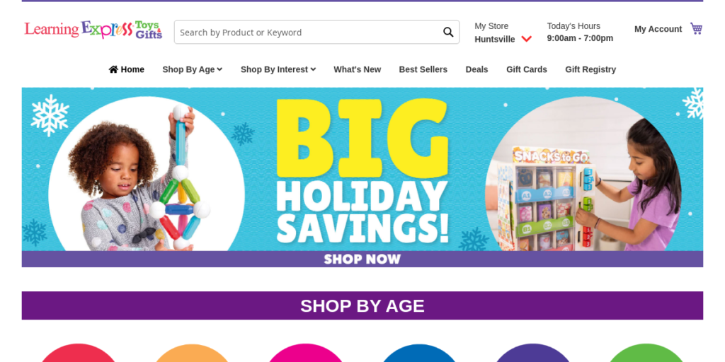
16. Toy Shoppe
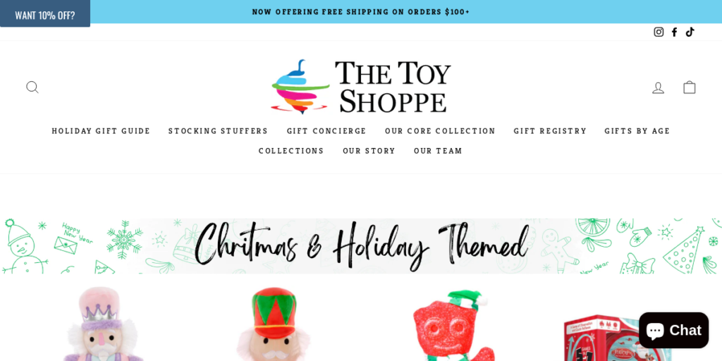
17. Replay Toys
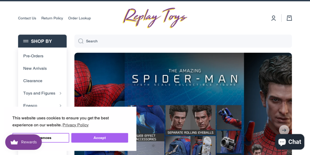
18. Oak Mountain Hobbies
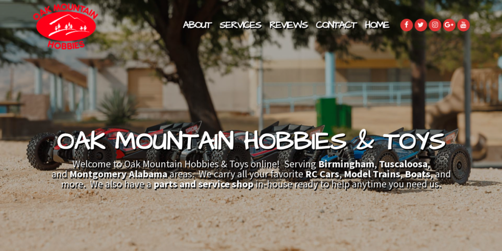
19. The Toy Bunker
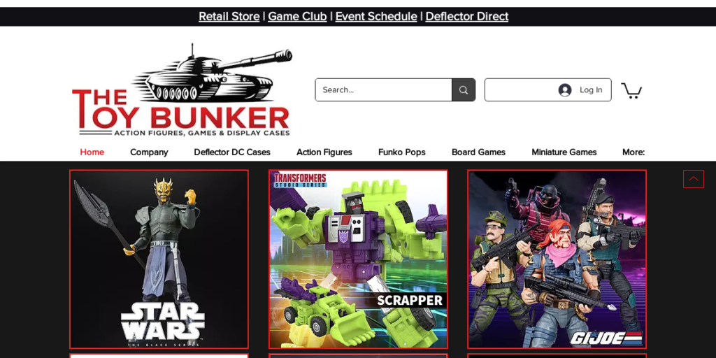
20. Lucys Toys
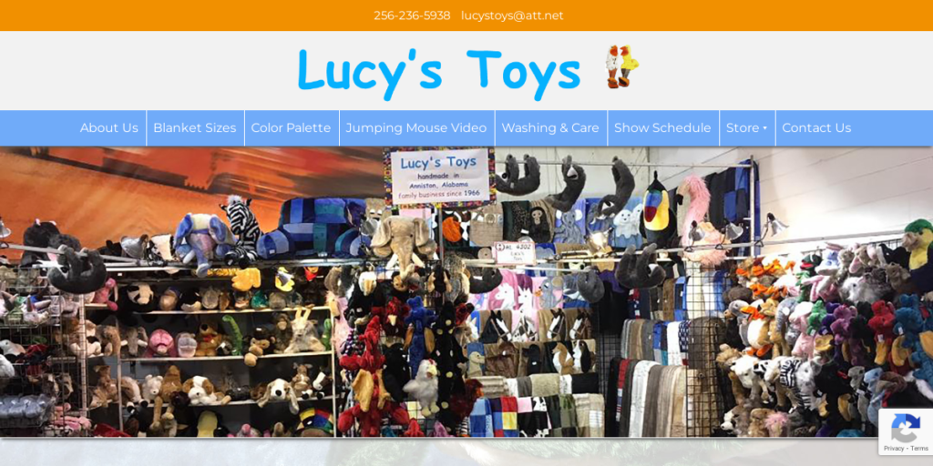
21. Swoopis Fun
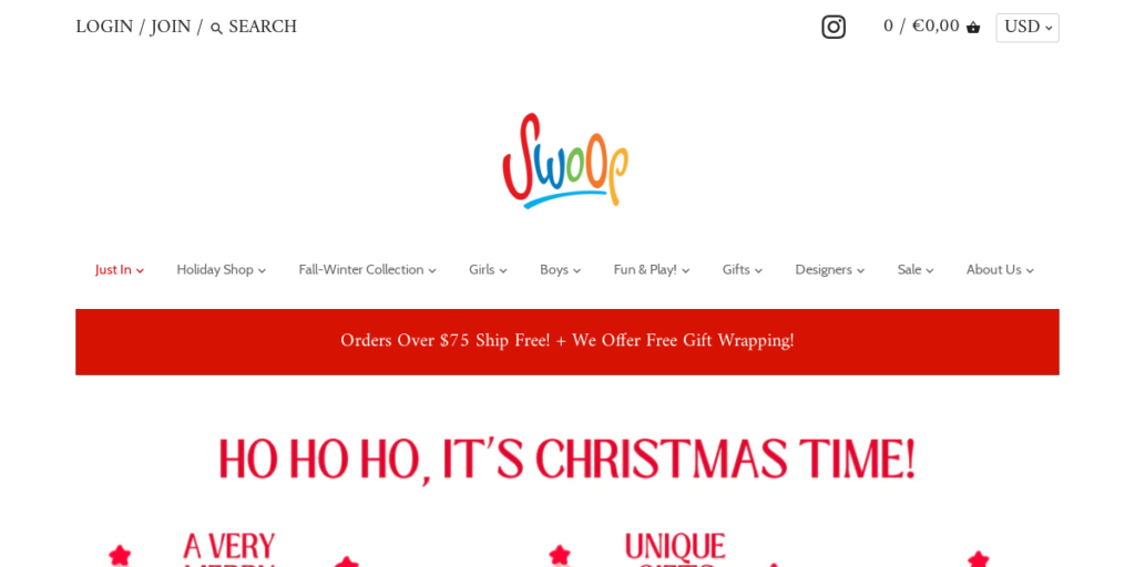
22. Terra Toys
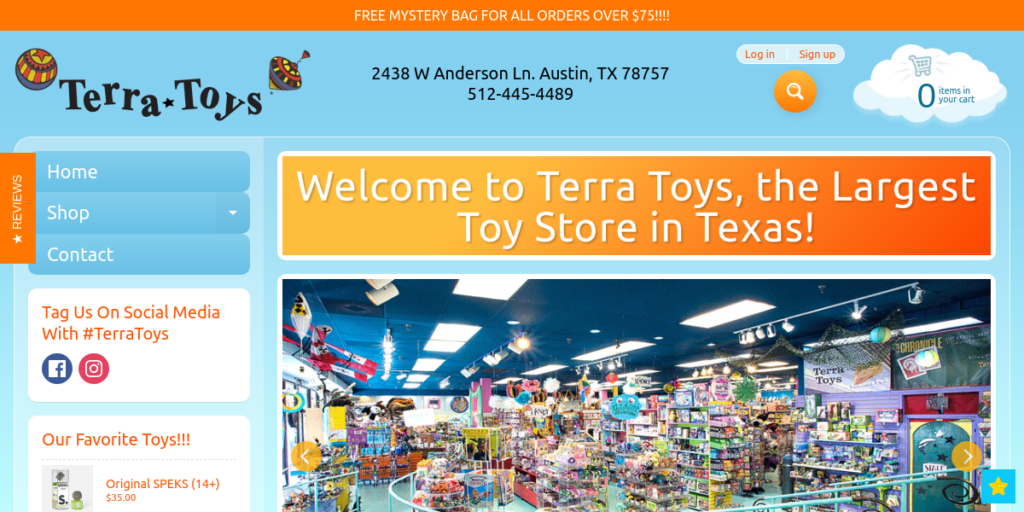
23. USA Toy Factory
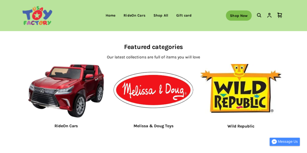
24. Toysrus Dream
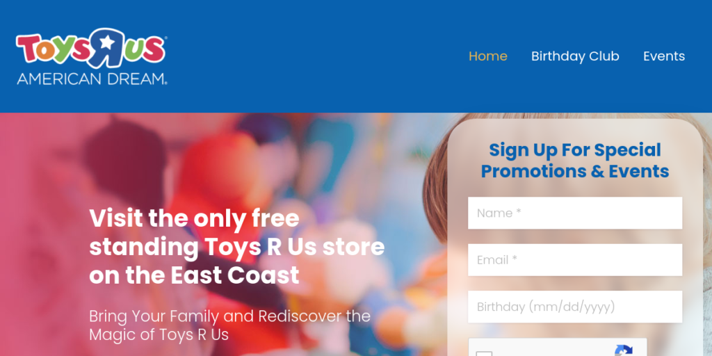
25. Toy Division Shop
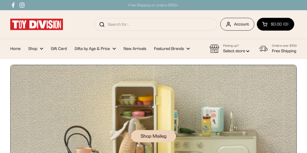
26. Chubzzy Wubzzy
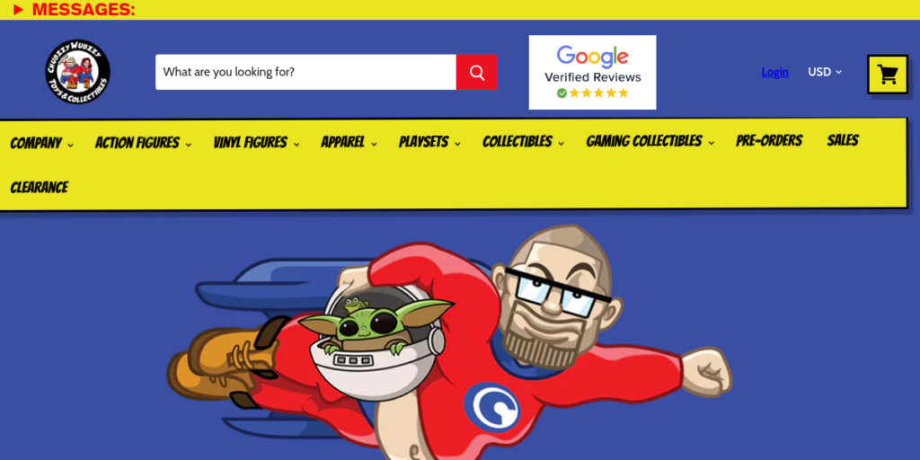
27. Toy Chest LLC
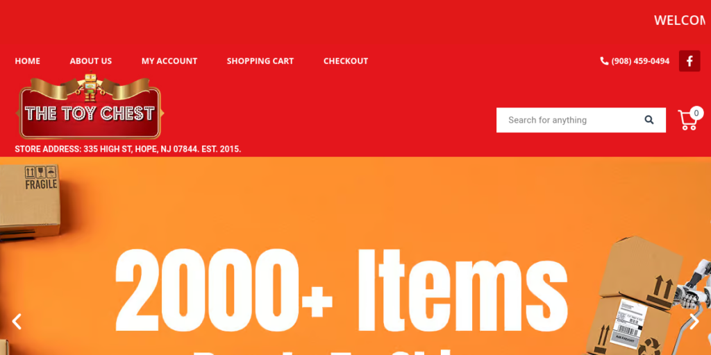
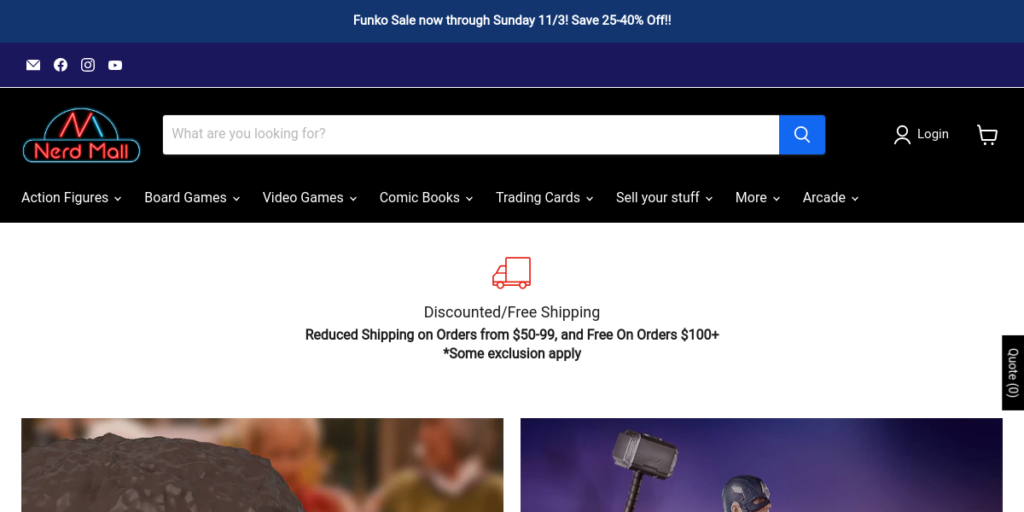
28. Nerd Mall
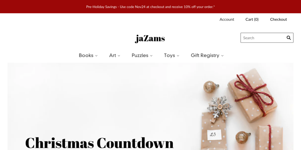
29. Ja Zams
30. Wonder World Toys
